
This page/post may contain affiliate links. As an Amazon Associate, as well as an affiliate of other programs, this means if you purchase something using these links, I will receive a commission on qualifying purchases at no cost to you! For more detailed information, please visit our Affiliate Disclaimer page
Color Theory in Bible Journaling
Ah color! God, the Master Creator, has blessed us with so many colors and variations of color. We find the dark green of ivy and the light green of ferns. The deep blue of the ocean and the light blue of the sky. The bright yellow of a lemon and the soft yellow of a daffodil.
Each color is also deep with symbolism, especially that of Bible symbolism. In previous posts, we’ve explored the meanings of red, green, white, black, blue and yellow.
Today, we’ll tie it all together and discuss the use of color, color meanings and color theory in Bible journaling.
Have you ever struggled to find the right color combinations for a Bible journaling spread? Have you agonized over whether blue or green would look better?
Using a color wheel and some basic color schemes, you can confidently choose colors which will look great together AND add deeper meaning to your Bible journaling.
So let’s dive in and take a look at the basics of Color psychology, shall we?

Color Psychology 101
Color psychology is the study of understanding how colors impact your psychology, behavior and emotions. Basically, the meanings of colors and what they symbolize to us consciously and subconsciously.
It is comprehensive and can be pretty involved, but let’s discuss the basics as it relates to our needs in Bible journaling.
Color, whether we realize it, or not, makes us feel something.
When we choose colors are are harsh or bold, they portray something different than when we use colors that are soft and soothing.
For example, studies have shown that people who sleep in blue bedrooms sleep more restfully than those who sleep in purple rooms. Blue is considered a calming color, whereas purple is one that is mentally stimulating.
In our previous studies of color, we learned that green symbolizes renewal and growth, envy and illness. Doesn’t green just remind you of spring and growth? Our brains are wired to connect the two.
We also explored red and how it symbolizes energy, romance, and of course, the blood of Jesus.
So, when you are creating a Bible journaling spread, consider the verse you are studying and what colors would help convey the message of that verse.
Let’s take this verse, for example:
Your word is a lamp for my feet, a light on my path
What color or colors come to mind when you consider light? Yellow, of course! When illustrating this verse, I would incorporate yellow.
What about this one?
1 Peter 2:9
But you are a chosen race, a royal priesthood, a holy nation, a people for his own possession, that you may proclaim the excellencies of him who called you out of darkness into his marvelous light.
Often, royalty is connected with the color purple, so you might consider using purple in your Bible journaling spread about this verse.
You might choose, instead, to select your colors based on how you want someone to feel rather than the idea that the verse or page is about. If you want someone to feel peace, you might use blue. If you want someone to feel happy, you might select yellow.
TRY IT: Open your Bible and read a few verses then consider what color or colors you might use if you were to illustrate it in your Bible journaling.
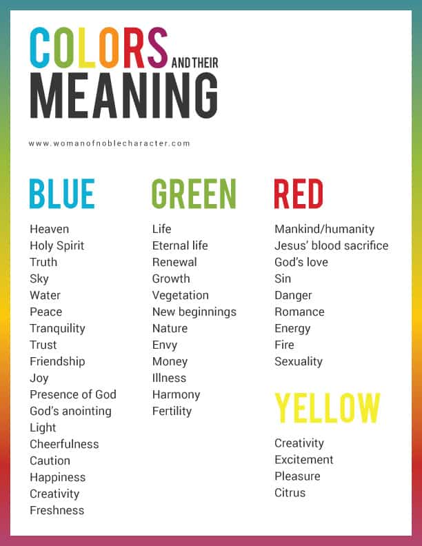
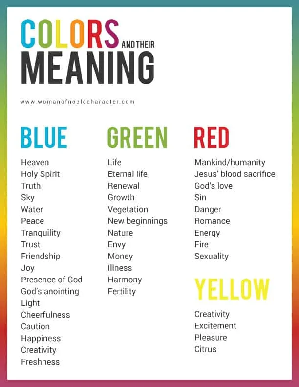
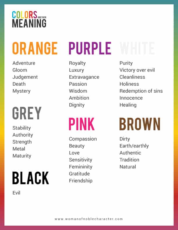
Here is a handy chart with colors and their meanings for you to use when Bible journaling.
(CLICK HERE FOR A DOWNLOADABLE/PRINTABLE PDF OF THE BELOW FOR YOUR HANDY REFERENCE)

Color Combinations and Color Theory
Now that you have decided what color or colors to use in your Bible journaling, we need to take it one step further. Most art (or even Bible journaling) has more than one color – but what colors go with the color you have chosen? Color theory can help with this.
You may recall from grade school studying primary colors and mixing colors. It’s probably been awhile (at least it has been for me!) so let’s review, briefly.
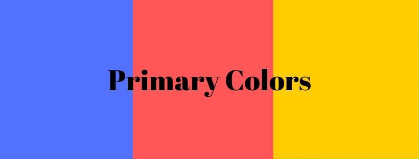
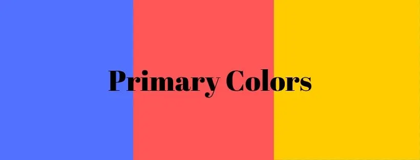
Primary
There are just three primary colors: red, yellow and blue.
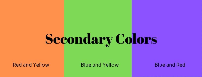
Secondary
Secondary colors are created by mixing two primary colors. For example: red and yellow make orange, yellow and blue make green, red and blue make purple.

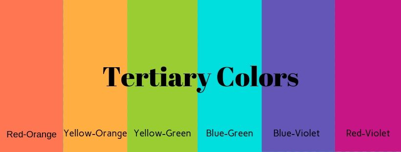
Tertiary
Tertiary colors are created by mixing primary and secondary colors.

Knowing the types of colors above is useful when deciding on color combinations for your Bible journaling projects and using a color wheel.
Color Combinations
Once you have decided on a main color (using personal preferences or the meanings of color discussed above), you can choose the other colors to use.
Using a color wheel (either online) or one you have at home (this color wheel is fantastic and inexpensive, too!), will help you choose colors that work together. (More on this below)

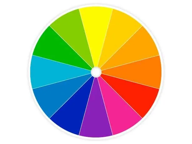
Color Wheels
You may have been introduced to a color wheel in school which shows you not just primary colors, but secondary and tertiary, as well. You can use a color wheel to help you choose colors that will work well together. If you choose colors that don’t play nice together, and you mix them, you will get a “lovely” shade of brown, so using a color wheel is really helpful.
We’ve already reviewed primary colors above, but, in a nutshell, with those three colors, you can create every other color that you can imagine! How awesome is that?
I’ll explain each of the color combination types, but you may wish to print the PDF below to use as a handy reference when creating in your war binder, Bible journaling, Bible art journaling or other creative projects.
So, now that you understand primary, secondary and tertiary colors, let’s take a look at how we can use these colors to create beautiful, cohesive Bible journaling pages.
CLICK ON ANY OF THE COLOR COMBOS FOR A DOWNLOADABLE/PRINTABLE COLOR CHART PACK
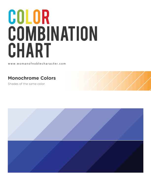
Monochrome
Monochromatic (or mono) is a color scheme based on only one color, in varying shades and tints. (If you are mixing your own colors, you can make a color darker or lighter by adding black or white to it).

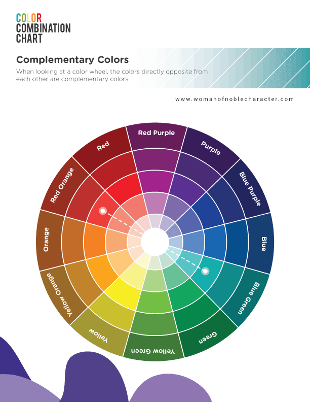
Complementary Colors
When looking at a color wheel, the colors directly opposite from each other are complementary colors.
For example, purple and yellow, red and green, and blue and orange. But you don’t have to stop there! Any color’s opposite can be a complementary color scheme such as red-orange and blue-green. They “complement” each other and always look great together.
Just don’t mix two complementary colors together using paint or markers or you will get brown (unless you want brown).

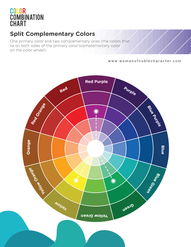
Split Complementary Colors
Split complementary colors are the two colors that are adjacent to the first color’s complement. They provide great contrast and add a different mood of color than just two complementary colors.

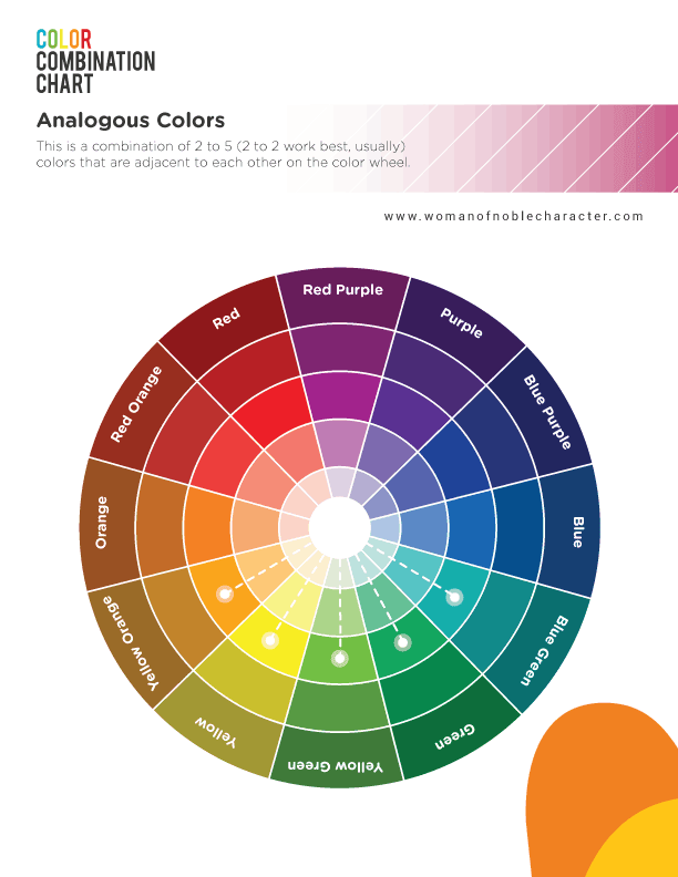
Analogous Colors
Analogous colors are those that include a primary color and several colors to one side of it. Some refer to these as “color families”. Think of reds/oranges/yellows or blues/purples.

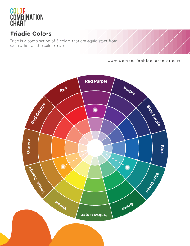
Triadic Colors
Triad is a combination of 3 colors that are equidistant from each other on the color wheel. They look great together, even when using different shades of these colors.

Other Color Schemes
Other color schemes include rectangle (those that form a rectangle on the color wheel) and square (you know what’s coming – those that form a square on the color wheel!).
Tying it All Together
So now that you know a bit more about color theory and the meanings behind colors in the Bible, you can use this newfound knowledge to create even more gorgeous Bible journaling spreads.
Here’s how to put it to use:
- Choose your Bible verse
- Choose your main color (using the above, what image or feel are you trying to convey)
- Choose your color scheme and additional colors in your spread
- Decorate as you normally would (with stickers, drawings, paint, etc.)
- Praise God, the Master Creator, for His Word and creativity!
Now that you know more about color theory in Bible journaling, which color schemes are you drawn to? I can’t wait to see your gorgeous Bible journaling pages!
Because of Him,
Sue
nike13rus
Friday 3rd of January 2020
I love how you incorporated several different techniques and mediums but kept the cohesiveness. The colors are gorgeous. That verse is one of my daughter’s favorites.
Susan Nelson
Friday 3rd of January 2020
Thank you so much! Stay tuned in 2020 for a three part course on Bible journaling techniques - from beginner to advanced :) Thanks for stopping by!
Diane@worthbeyondrubies
Wednesday 18th of September 2019
This is absolutely AMAZING! I studied interior design a LONG time ago and this post on color theory is one of the best I have ever read. This is so incredibly helpful, especially for someone like me who is fairly new to the Bible journaling world! I love this! Thank you for sharing all your knowledge with us and thank you for linking up @worthbeyondrubies